THE JUICE BOX
this project will always be a meaningful and treasured memory. my former boss and long time friend decided to pursue his dream and open a tap room in the small town that we both grew up in - Centralia, WA. he is an avid craft beer connoisseur and has spent several years marketing different breweries and being highly active in the beer community and culture. The Juice Box is the realization of an attempt to bring the best quality beer experience to a blip on the map that had just started dipping its toe into that water.
THE PROBLEM:
Michael (Perozzo) approached me with a specific color palette in mind and a lot of nostalgic references from the 90’s as sources of inspiration and direction. we discussed everything from the ‘96 NBA All-Star jerseys to Nickelodeon and Rocko’s Modern Life. from the beginning we knew that The Juice Box was going to be expressed through many iterations, but the most important element to nail was a symbol that was so distinct and recognizable that you didn’t need words to know what it represented.
a juice box was the obvious symbol due to the name of the business and I must say, a juice box is a challenging object to make appealing. the natural progression of thought is to form a rectangle with a straw sticking out of it, but a straw that naturally hangs off to the side is always battling with symmetry and can cause a feeling of imbalance and awkwardness.
THE SOLUTION:
in order to make a straw feel more in-balance with a rectangle, there needs to be a change in perspective - a 2-dimensional box isn’t going to cut it. So I began with a perfect 3-dimensional box and Michael was not digging it. it wasn’t unique. he said to crunch the box and make it look like it had been squeezed a bit, like someone had actually clutched it in their hand. heeding his instruction, I bent the back edge slightly and exaggerated both edges of the front panel to create the effect he was looking for. after we achieved the right shape for the box, we found the right straw to pair with it and ended up with something that we both loved!
THE FONT:
as mentioned previously, I used the ‘96 NBA All-Star Game jerseys as a reference and looked for a font that was comparable. after peering through a dozen or so sporty fonts, I settled on one that felt sporty, but was also purposely imperfect which nodded to the Nickelodeon inspiration. after settling on a font, color palette and a solid icon, we could move forward with creating other representations of the business for particular purposes.
THE EXTRAS
Michael also had the vision of creating specific glassware for each style of beer. each glass would be a different shape and would feature a fun design that would enhance your experience and make being there that much more enjoyable - and I must say, it worked!
we caught wind that Michael’s business partner, Levi, had a thing for jackalopes. Michael thought it would be cool to have a design that featured a jackalope having a beer. I thought it would be funny to have that jackalope drinking out of the same glass as the person enjoying the beverage. so I made a vector out of a picture of the glassware, then took that whole design, shrunk it down and put it on the glass that the original jackalope was drinking out of to create what we referred to as “jackalope inception”.
you may or may not be familiar with a popular 90’s rap group known as Wu-Tang Clan: they had a song called C.R.E.A.M. which was an acronym from Cash Rules Everything Around Me. for some reason, a popular design parody emerged that played on the Drug Abuse Resistance Education branding from the 90’s (also known as D.A.R.E.) exchanging the letters with C.R.E.A.M.. Michael came up with his own clever parody - J.R.E.A.M., which stands for, Juice Rules Everything Around Me. I made the design for him and he put it on a glass that it fit quite nicely. of course, only fancy fruity beers are served in this one.
the cider glasses are also marked with a recognizable parody. I probably don’t have to explain this one.
I also made a 50’s inspired design that was meant to mimic beer advertisements from decades ago that simply states, “Beer-Flavored Beer…For when you just want a beer”. this one is reserved for the ol’ reliable pilsners and lagers.
let’s not forget about the Winosaurus Rex for the wine glasses.
the standard glass comes with a standard design that lets you know exactly where you are.
THE STORY CONTINUES
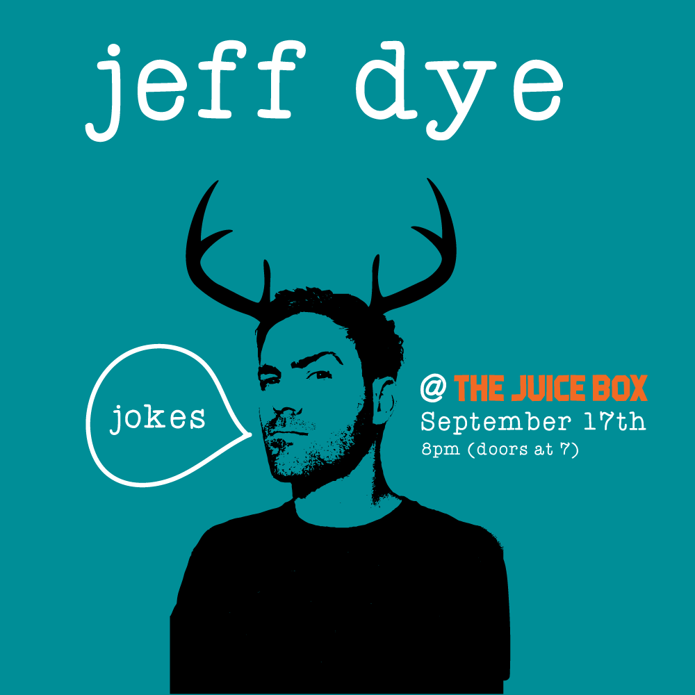
though I have said much to paint the picture and tell the story of The Juice Box, there’s still so many more fun tidbits to mention! the space that has become The Juice Box was previously an Elks Lodge (where I used to play concerts back in my head-banging days) that came complete with a 100-year-old stuffed elk head - now referred to as ‘Arthur’. since Levi likes jackalopes and Michael had endeared himself to an inanimate elk who was so affectionately named, I just started putting antlers wherever I could, because it was fun.


-

a gift card design was also needed
-

as well as an outdoor sign
-

and an indoor sign
-

stickers
-

posters
-

and other signage


