BIKE CLARK COUNTY
Bike Clark County is an awesome not for profit organization that organizes programs to serve the community in cycling safety as well as bicycle maintenance. they are a full service repair and retail shop with new and refurbished bicycles and gear at a discounted price.
THE PROBLEM:
Bike Clark County needed t-shirt designs, so I threw my hat into the ring. there were a couple clues given, but it was mostly a wide-open opportunity to be creative. one hint was a common phrase used among cyclists - “pedal on”. after observing the style of the workers and general culture of those that ride as a lifestyle, seeing the color palette and other representations of the brand; I wanted to create something that was unique and non-obvious. it’s really easy to use the usual symbols synonymous with cycling like wheels, gears and chains, but that didn’t seem to be what they were looking for.
THE SOLUTION:
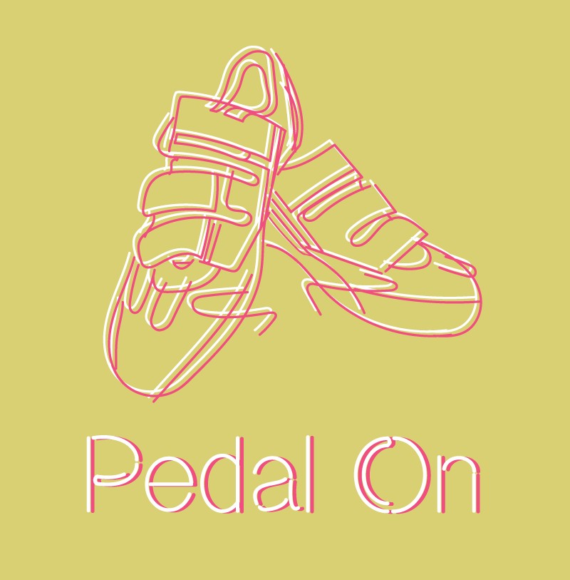
I began to search for ideas by looking through the pictures on Bike Clark County’s Facebook page. I came across a pair of cycling shoes for sale that caught my eye - they served as the perfect symbol that was unique to the hobby and was also a good visual representation of the phrase “pedal on”. so I downloaded the pic and traced the outlines with my Wacom tablet in Illustrator.
I then skewed some of the lines to make it feel a little more abstract with a nod to a popular style I had seen growing in Portland. the simple white on black lines I think makes for a good t-shirt design that I would probably wear, but I thought I would add some color options. I doubled the lines and colored one of the sets with a bright color to contrast with a different bright colored shirt. BCC has lime and yellow as the primary colors for their logo so I thought the following would be suitable options.


